The Holiday Card That Almost Wasn’t
Last year we sent out our first company holiday card. What should have been an easy design and print job was almost thwarted by print industry standards and what could easily be called a production disaster. This adventure in stressland resulted in a slightly different card from what was originally designed and a really great case study in sustainable design perseverance.
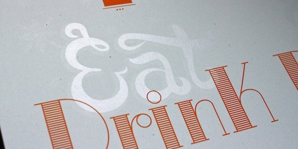
As a design company, we are required by natural law and self-respect to design our own holiday card. And as a sustainable design company, it needs to be a good example of reducing your environmental footprint (and yes, we realize the slippery slope leads to not sending anything at all, but e-cards are as impersonal as not sending anything at all). With a small holiday list, we designed the card to be a two color print of white and orange on soft blue paper.
Our first barrier came with the paper selection. The blue paper we had picked out turned out to be a “mill item” meaning that the printer could only buy the paper by the case load. This would result in enough paper to print quadruple the amount of cards that we would need (and who needs 400% more holiday cards?). Aside from making the paper insanely expensive, those extra sheets would essentially be trash if we couldn’t figure out what else to do with them. It should be noted, the paper we picked was available online in a small pack size, but the code of printers and their paper buyers makes it unethical to purchase paper outside of a buyer. Unfortunately buying far more paper than necessary and then throwing the excess away is considered ethical in the print industry.
So after grudgingly choosing a different paper (with unfortunately low PCW content)that could be acquired in low quantities, we received test prints from the HP Indigo which has the nifty ability to print white ink. It looked great! Score!
And then the estimate came. Turns out that white ink may as well be 24 carat gold foil considering the cost and our design required multiple hits of ink. So while the paper would now be affordable, the printing would not.
With time dwindling but firm resolve, we tried for a screenprinter. They could get the paper we wanted (100% PCW, French Paper) and print the small quantity we needed at a price we found reasonable. Hallelujah! We sent off the artwork and waited for the prints to arrive.
A week later we received the email that every designer hates to get (and every printer hates to send). Something had gone wrong. Very wrong. The inside of the cards had been printed upside-down. Every card. The printer was completely distraught. In all his years, this had never happened before. And knowing that these were holiday cards he realized there was no time to repurchase the paper, reprint, and make it right. It seemed that our holiday card was truly cursed. We emailed him back and said that mistakes happen, this wasn’t a client project, and was not essential. Give us some time to think about what to do, and in the meantime, don’t throw anything away.
We couldn’t toss all that beautiful paper. Cursed or not, this card had to be saved. As you can see in the pictures, our card was to say “Eat Drink” on the outside and “& be merry” on the inside. We started to joke about how funny it would be to print “even if things to don’t come out perfect” right-side-up with an arrow pointing to the flipped “& be merry”. Then perhaps add the line “To a resilient 2013!”. It made us laugh and captured both our sense of humor and our commitment to sustainability. What the heck.
Before proceeding we asked the printer to drop off a sheet so that we could see how his white ink looked on the light blue paper, just to make sure the print was worth salvaging. He came right over and when we pulled out the sheet, we just about screamed for joy. All that had been printed was the “&”!!!
Well this was totally different from what we had thought! An upside ampersand could easily be turned into a design element. And so, that’s what it had to be. We sent over some new artwork to the printer showing a snow flurry of ampersands covering the interior top of the card, with our same “& be merry” message on the bottom. The printer loved it and so did we.
Two days later the cards were being signed by us and sent out in the mail. Late. Very late.
I remember a quote I read back in middle school from John Wooden saying “Things turn out best for those who make the best out of the way things turn out.” It was this attitude combined with our persistent desire to prevent unnecessary waste that turned a disaster into something funny and notable.
That being said, next year we may rethink an e-card.


